Building an exceptional healthcare workforce through excellence and expertise in education.
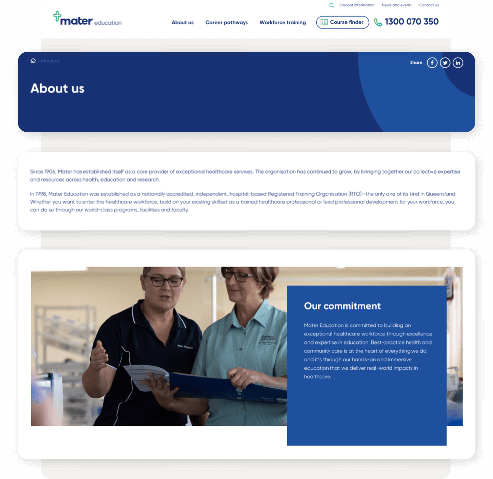
Established in 1998, Mater Education is Queensland’s only nationally accredited, independent, hospital-based Registered Training Organisation.
With hands-on and immersive education, Mater Education lays the foundations for an exceptional healthcare workforce. Whether Queenslanders are entering that workforce, building on their existing skillsets or empowering their teams with professional development, Mater Education helps them do it with world-class programs, facilities and faculty.
Mater Education is part of the larger Mater Group, which has been providing a broad range of care services since 1906. Constantly growing and evolving, Mater has modernised its brand in recent years to reflect its role in the community as a compassionate health partner, supporting Queenslanders to make better choices about their health.
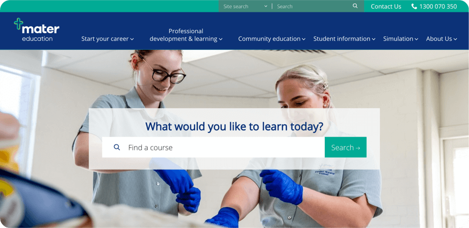
Mater Education legacy website:
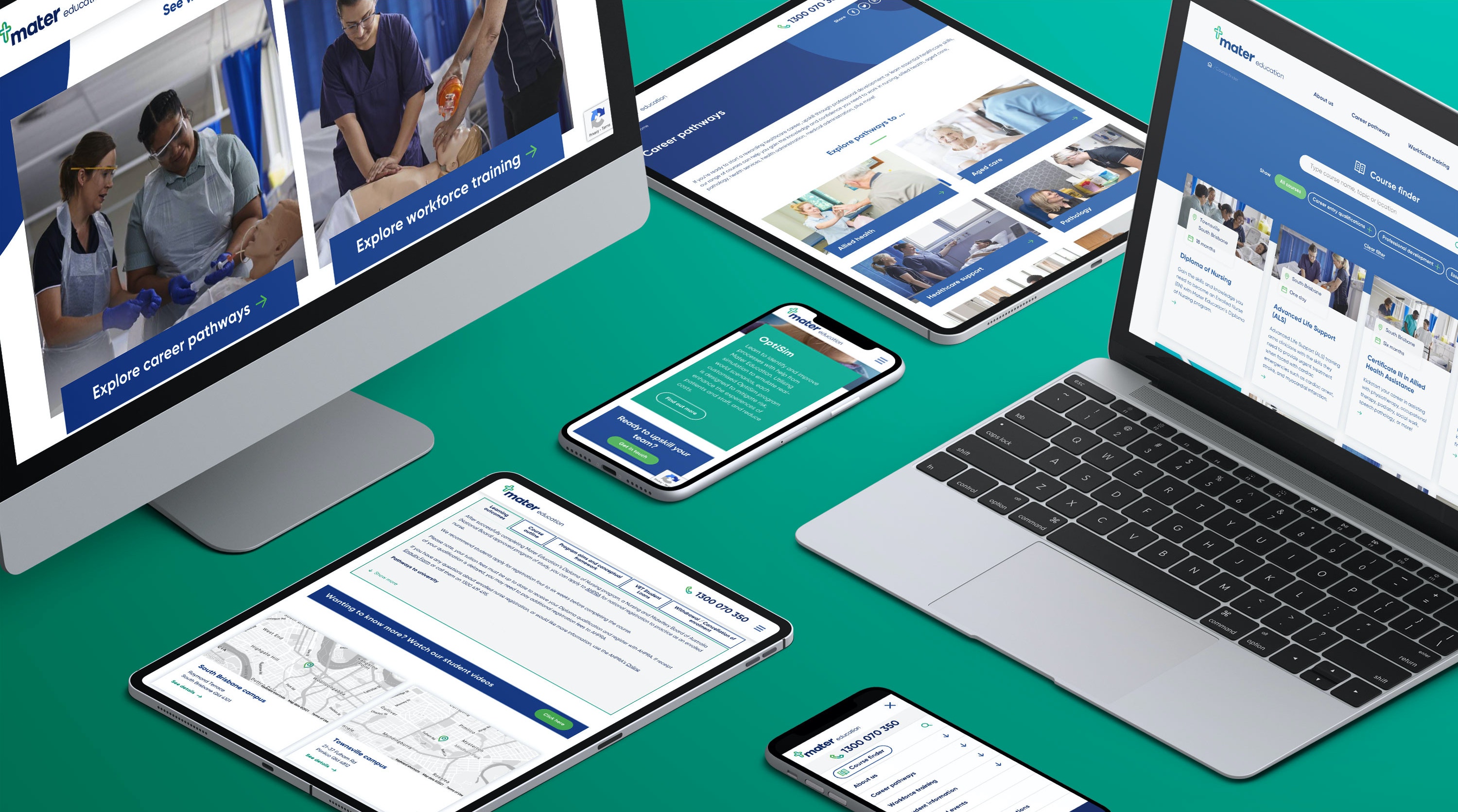
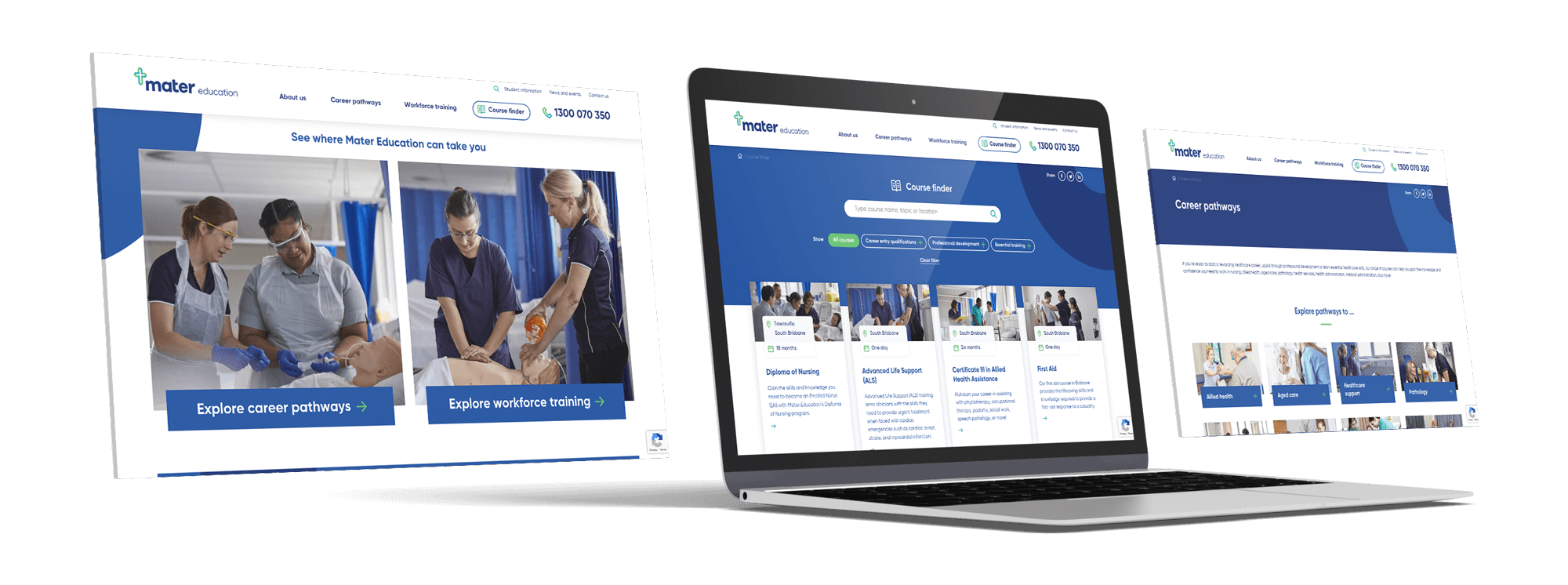
In keeping with that approach, Zeroseven was tasked with building a modern and user-friendly website for Mater Education that would make it easier for current and prospective students and professionals to find the right courses and workshops for their desired career pathway or organisational need.
A complete rebuild executed on a compressed timeline, the resulting Mater Education site hasn’t just made users’ lives easier – it’s immeasurably improved the experience for web editors working on the site as well.
A better experience for users
Built bespoke to Mater Education’s requirements, the new site has been designed with ease of use as the top priority.
That meant rethinking the information architecture of the site from the ground up. The available courses had previously been laid out in a matter-of-fact fashion that made sense to the people facilitating them, who were already familiar with what Mater Education had to offer, but could be confusing and overwhelming for site visitors. Now, the information is structured in a way that helpfully guides users towards the courses that are relevant to them.
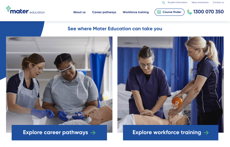
Zeroseven worked with Mater Education to map out the user journey – how someone would get from Googling ‘I want to be a nurse’, for instance, to finding the right course. As a result, visitors to the new site are greeted with a presentation that centres their experience and their requirements.
The Career Pathways Journey
Visitors who select ‘Explore career pathways’ are then taken to a menu that organises the available courses by career pathway, as a user would want to see them, as opposed to organising them by discipline or course name, as might come naturally to a facilitator. This approach allows for cross-pollination, as certain courses are relevant to more than one pathway.
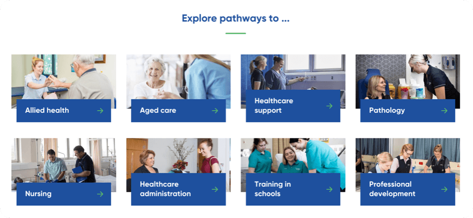
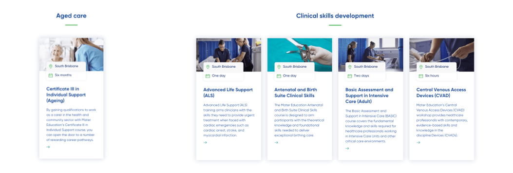
If the user is interested in a career in aged care, for instance, they simply click that icon, and are taken to the relevant course. Before they even click through to a particular course, the location and the time it takes to complete are displayed.
On the other hand, if the user is already advanced on their career pathway and is interested in professional development, they are taken to a page that logically lays out the courses available to help them develop skills in specialty areas.
Tailoring Programs to Organisational Needs
If the user selects ‘Explore workforce training’ from the home page, they are provided with information about how Mater Education can tailor programs to their organisation’s needs.
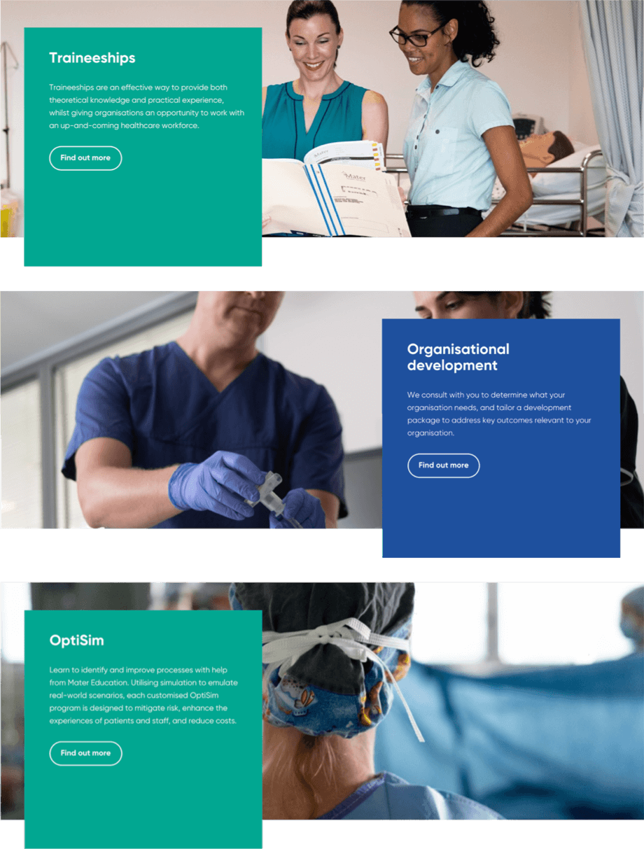
Each of these pages cleanly lays out the key takeaways for each of these options, and includes examples of how Mater Education has provided these services in the past.
The Course Finder
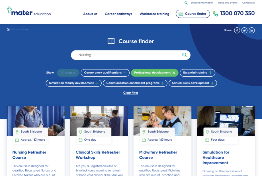
Some visitors to the site will already have a clear idea of what they’re looking for, and won’t want to be guided through the process of finding it. Those users can select the ‘Course finder’ icon found at the top of every page and start typing.
As they type, they’ll be presented with suggested search terms. User-centric filters are available for the search results – for instance, someone who types ‘Nursing’ will no doubt be presented with a Diploma of Nursing, but if they’re already a registered nurse, they can click the ‘Professional development’ filter to ensure they only see courses that are relevant to them.
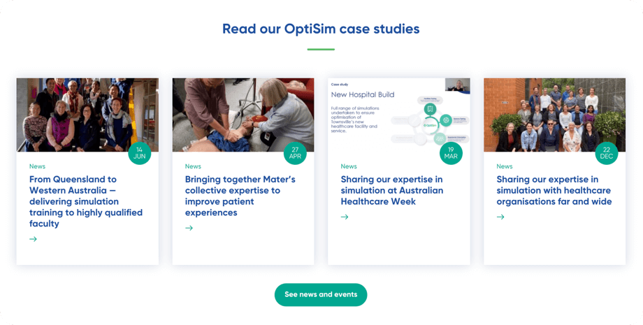
Topical news content
Zeroseven also migrated existing news content to the new site, and added an extensive range of category filters so users can quickly drill down to the content that relates to their field and is likely to interest them.
Improved performance
Aside from the superior UX design, the new site also loads faster and is less prone to error than the site’s previous incarnation. Improved performance metrics like these are important ranking factors for Google Search, and more importantly, in line with virtually all of the other decisions made with regards to the site’s design, they enhance the user experience.
A better experience for web editors
The site is built on Kentico Xperience, the all-in-one Digital Experience Platform (DXP) from Kentico Software.
The modularity, customisation and intuitive interface of Kentico Xperience enables Mater Education to add new pages and content to the site with minimal effort, using custom widgets and layouts developed by Zeroseven.
Crucially, these widgets are able to pull information directly from Mater Education’s student management system. This means that rather than manually entering information like the cost, duration and location for each new course that is added to the site, the custom widgets can take these details automatically from the student management system.
Similarly, as course details change over time, these changes only need to be made to the student management system, and will then be automatically reflected on the site – before the rebuild, these changes had to be made to the site manually.
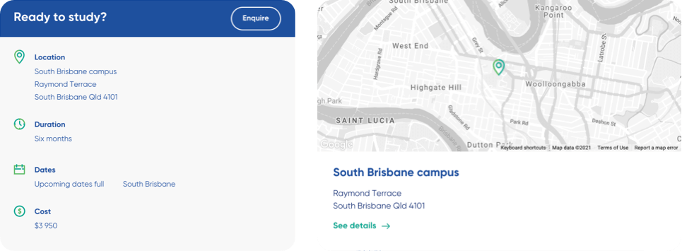
If the widgets happen to pull in text that Mater Education’s editors would prefer to replace with stronger messaging, controls have been built in to allow them to override these details.
To build new pages, editors simply need to stack different types of widgets. The widgets are intuitive – if they’re added to the page for a particular course, for instance, they can refer to the student management system to determine which location the course is held in, and automatically generate the map and the ‘See details’ link that will take the user to the relevant campus page.
Modular building blocks
The modularity of the widgets allows for editors to change page layouts with ease. If they want to move or remove a banner from the top of a particular page, for example, they don’t need to call a developer – it’s simply a matter of moving or removing that widget.
That modularity even applies to FAQs. While the site does have an all-encompassing FAQ page, it’s also set up as a repository, so editors have the ability to select specific questions and answers and add them to specific pages, just by placing a widget on that page.
A better healthcare workforce
The new website has only recently launched, but Mater Education reports that the platform has significantly reduced the amount of time they need to put into updating and maintaining the site.
Ultimately, the success of the site will be judged on how it delivers on its primary purpose – to make it easier for people to find the information they’re looking for, leading to more people enrolling in Mater Education courses and workshops.
Given the superior user experience offered by the new site, however, and the guided pathways it offers to new students and working professionals alike, Zeroseven expects it will lead to an uptick in enrollments for Mater Education.
Mater Education is building a better healthcare workforce, and now, they have a website that truly reflects their excellence and expertise.
