4 min read.
Zeroing in on a new look: How we revamped, refreshed and redefined Zeroseven
Zeroing in on a new look: How we revamped, refreshed and redefined Zeroseven
We know as well as anyone that the nature of web design and development is one of constant change and evolution. Over the last few months, we’ve looked inward and applied this philosophy to our own brand and web presence.
Working with Brisbane branding agency Ravel to define our values, we boiled it down to the essentials of who we are and what we’ve always stood for. We then built a new site that reflects our identity, our values, the high calibre of clients that we partner with, and the world-class solutions we develop for them.
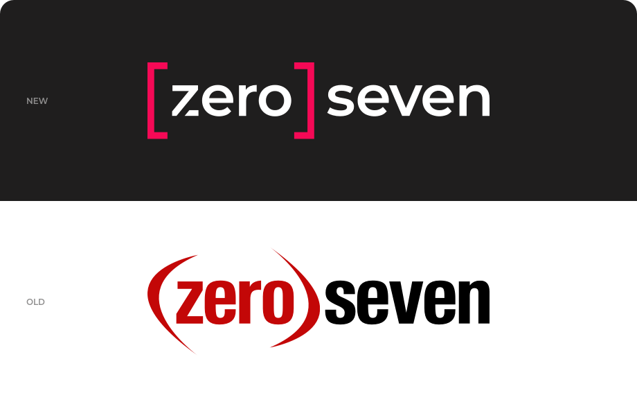
Logo
We wanted to modernise our logo and bring it into the now, while still nodding to our history.
To that end, we kept the brackets that have always been part of our logo (a nod to Brisbane’s (07) area code), but updated them with a stable geometric structure.
The modern sans serif font was chosen for its sense of openness, reflecting one of our core values.
The most fun addition to the logo is the customised ‘z’, which now includes the number 7, adding a sense of concept, depth and personality to the design. Better yet, it means we can now use that customised letter as a standalone icon to represent the brand.
The overall effect is stable, but innovative, and approachable, but stylish – a true snapshot of the Zeroseven experience.
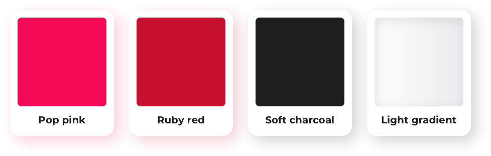
Colours
We chose to respect our classic black, white and red colour scheme, while exploring different shades and highlights to create something out of the ordinary.
Retaining the ruby red from our existing branding helped us to maintain a sense of familiarity, but we also introduced a soft charcoal to provide a sense of depth and coolness, and employed a white-to-grey gradient to give backgrounds more balance, breathing room and dimension.
But the most eye-catching addition is our new pop pink colour – it’s fun, invigorating and vibrant; popping against the charcoal and complementing our other colours perfectly while serving as an irresistible call-to-action colour.
It all adds up to a fresh and clean look that’s easier on the eye than ever.
Headless CMS
We took the opportunity to future-proof the revamped site by building it on Kontent by Kentico a headless content management system.
A headless CMS is one that separates the ‘head’ – where your content is displayed – from the ‘body’, where the content is created and stored. Using this flexible and modular type of CMS, you can build a repository of content that isn’t co-mingled with code, so it can be published across an endless variety of platforms and devices.
Essentially, it frees your content from the webpage-oriented framework that a traditional CMS requires, and makes reusability for virtually any purpose a breeze. It’s not that your content won’t have a ‘head’ – it’s that you can give it as many different heads as you want, without doing any more work on the body.
A headless CMS also enables real-time collaboration and seamless workflows, making it easy for distributed teams to create and deploy quality content together.
Better yet, when the day inevitably comes to reskin your website, the nature of the headless CMS ensures that your content won’t be affected by your site’s new look.
We believe the headless CMS is a great option as businesses, their websites and applications evolve. It'll have a game-changing impact on businesses that have reusable content that has been traditionally tied to website layouts – so it was important for us to build our own site with Kontent.
Values
We love working closely with clients and getting to know their business on a deeper level – but in this case, we took the time to get under the hood and figure out what makes our own business tick.
Ultimately, we narrowed it down to six values that define the DNA of Zeroseven.
Our DNA
We make the complex simple.
Our power is in our people and processes. We’ve been at it for a while (we’re talking decades), and have spent this time refining our processes to ensure our approach solves complex problems while delivering on your business and project objectives.